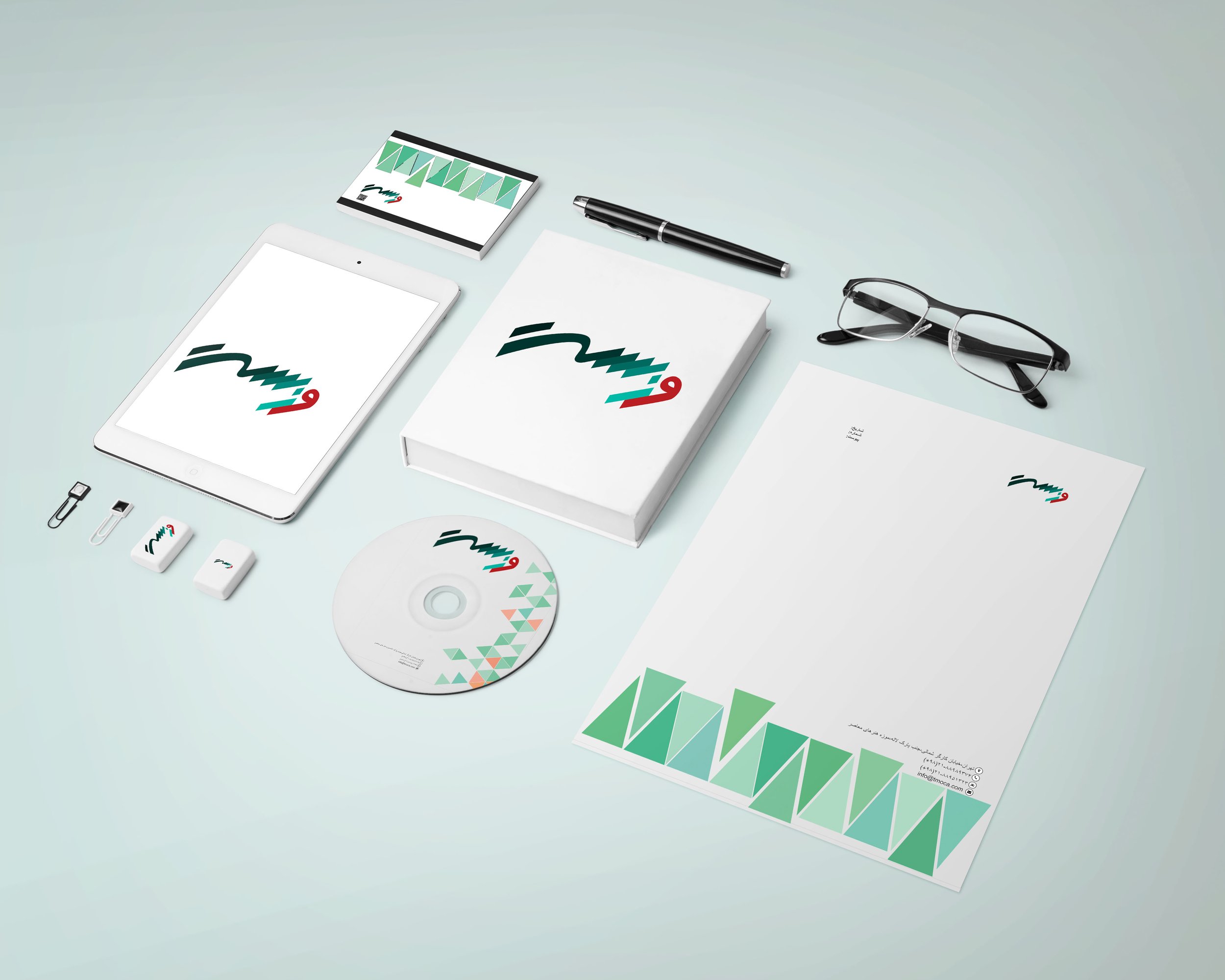
Packaging Design
These are selected packaging designs created for the apparel brand Mooch and Takoo. The brand focuses on clothing inspired by traditional Iranian attire, motifs, and symbolic elements rooted in Iranian art and culture.
Sustainability and reusability were central to the design process. The brand emphasizes environmental responsibility and reducing pollution, so the packaging was developed with minimal waste and long-term use in mind.
I incorporated origami and pop-up techniques to create foldable yet structurally strong packaging that can be reused and requires minimal chemical adhesives. The geometric folds not only enhance durability but also create an interactive and engaging unboxing experience.
The visual identity draws inspiration from Iranian painting, architectural motifs, and traditional symbolic patterns. I approached the packaging as more than a container, but as an amusing and memorable piece of art that enhances the customer experience while reinforcing the brand’s cultural identity.

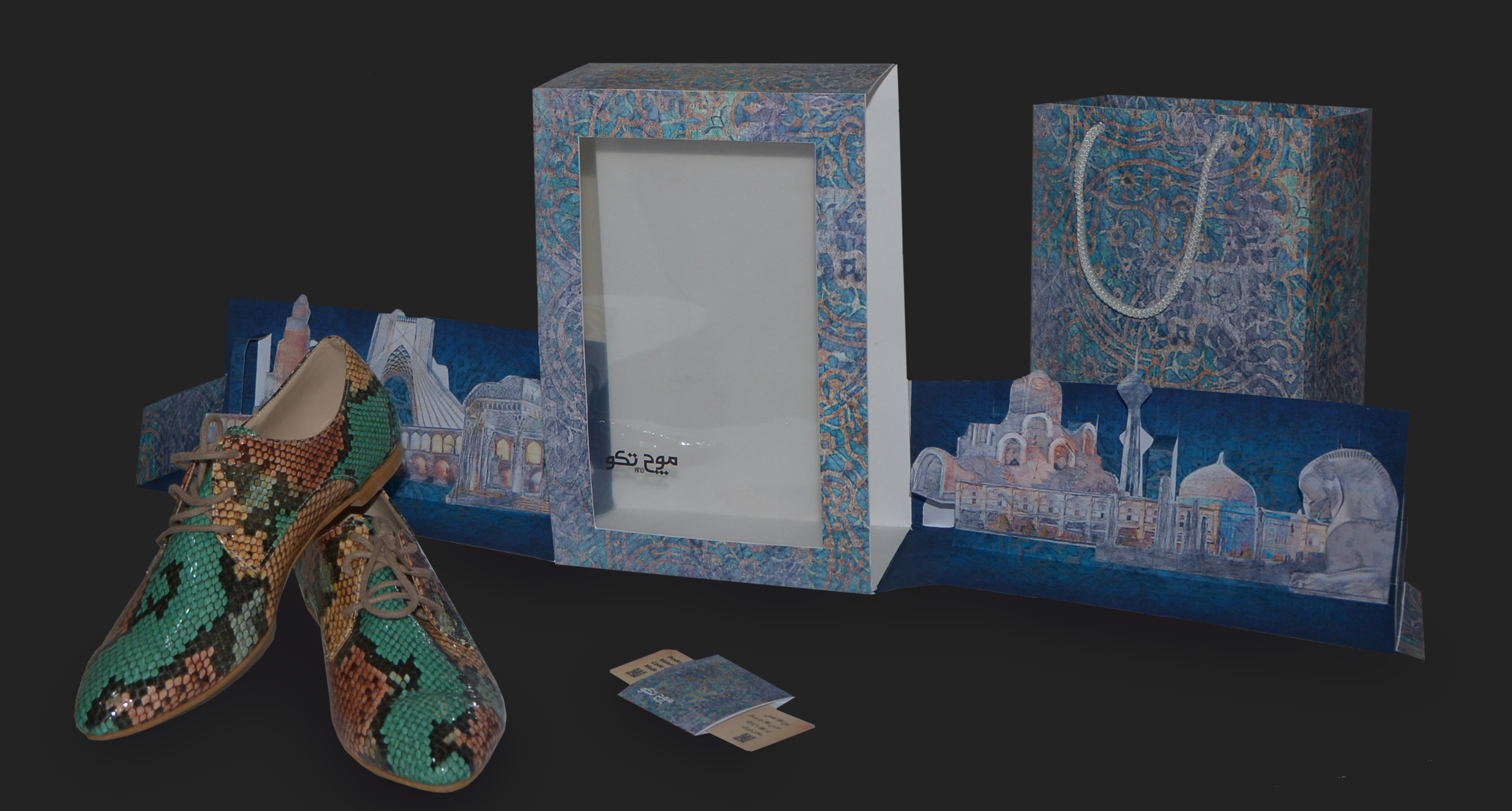
This is the packaging design for Mooch and Takoo shoes. The left and right sides of the package feature pop-up illustrations of well-known cultural and tourist landmarks from different cities. When the shoes are placed inside the box, the folded structures cover the sides like a pop-up book, and when the box is opened from the sides, the landmarks unfold as pop-up elements.
Through this design, I aimed to emphasize the durability of the packaging and shoes while reinforcing the brand’s identity, which promotes culture, history, and traditional craftsmanship. The cover design draws inspiration from motifs commonly found in traditional architecture and textile patterns from the region.
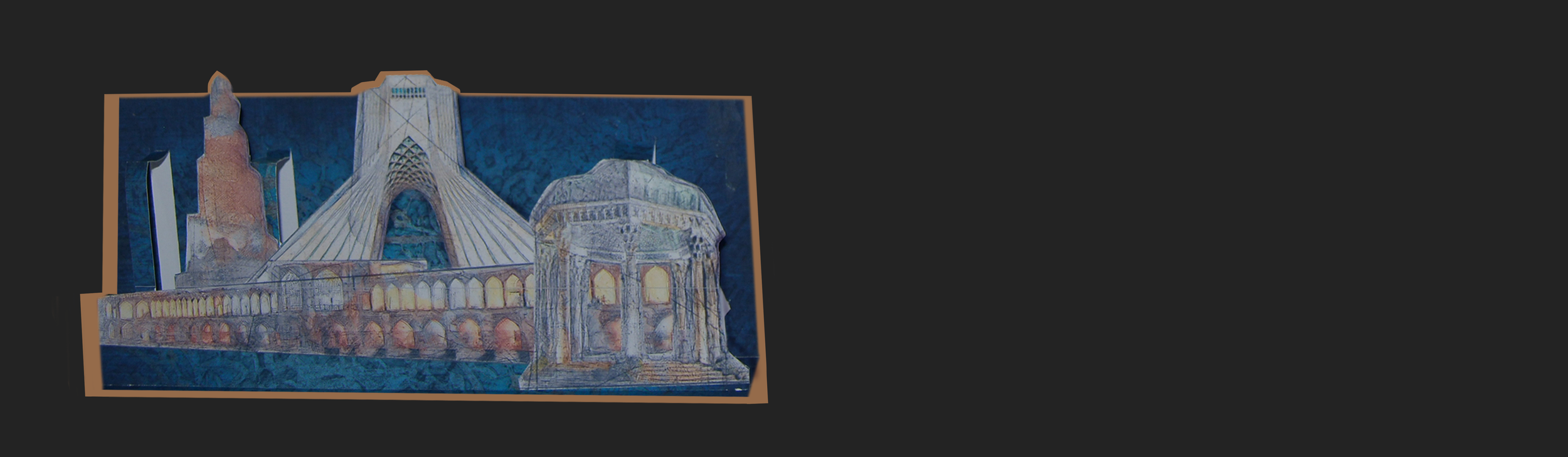
Close-up view of the pop-up side of the shoe box.

This is a closer view of the product certificate, which uses a pop-up technique. It functions like a card where, when one side is pulled, the other side opens simultaneously, revealing the product information in different languages.
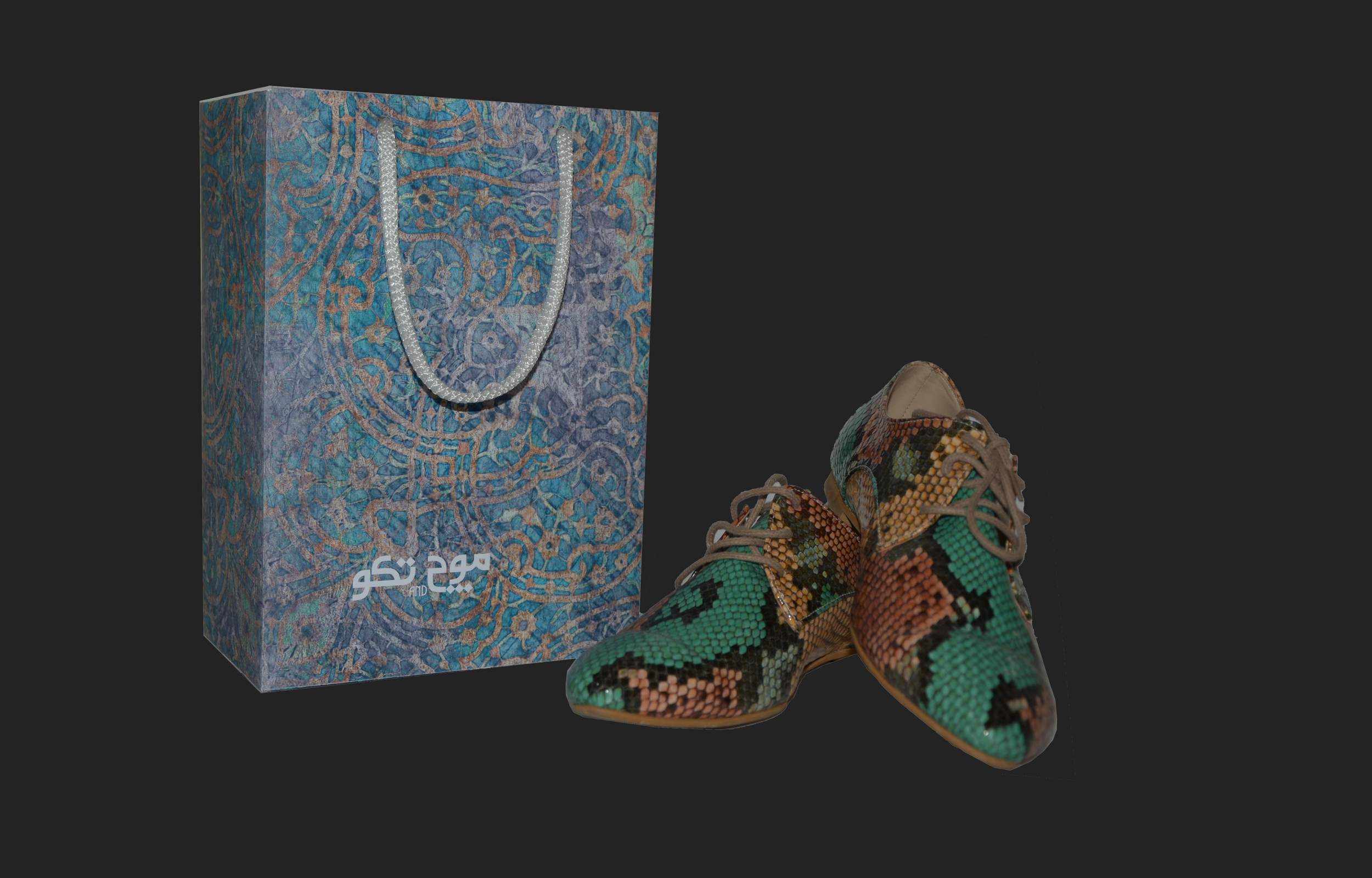
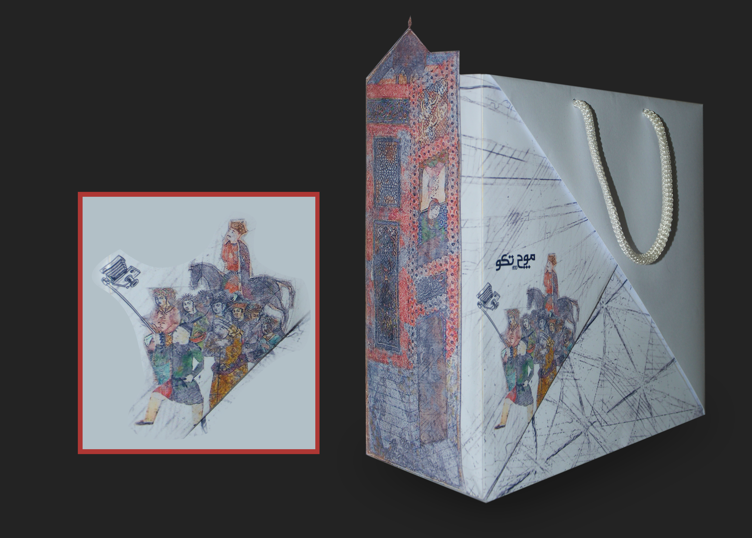
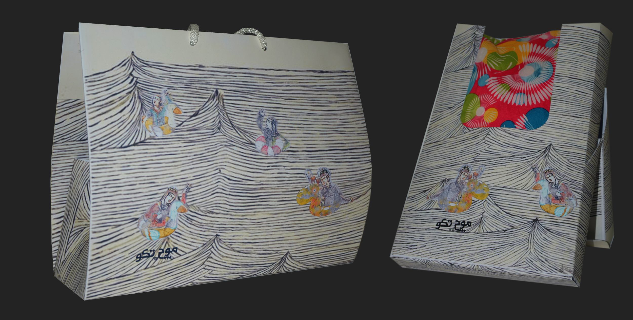
All materials and product are placed in this shopping bag, decorated with motifs inspired by Persian architectural and textile patterns.
These are additional packaging designs for the Mooch and Takoo brand. Since the brand emphasizes sustainability and reusable packaging, I incorporated origami techniques to create foldable structures that encourage reuse and reduce waste.
For the visual design, I drew inspiration from Persian miniature characters. To create a playful and engaging experience, the character is shown performing a modern activity, such as taking a selfie, blending traditional visual style with a contemporary touch.
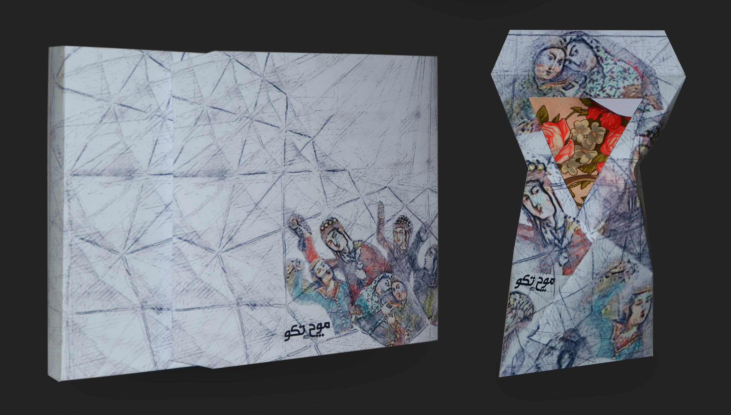
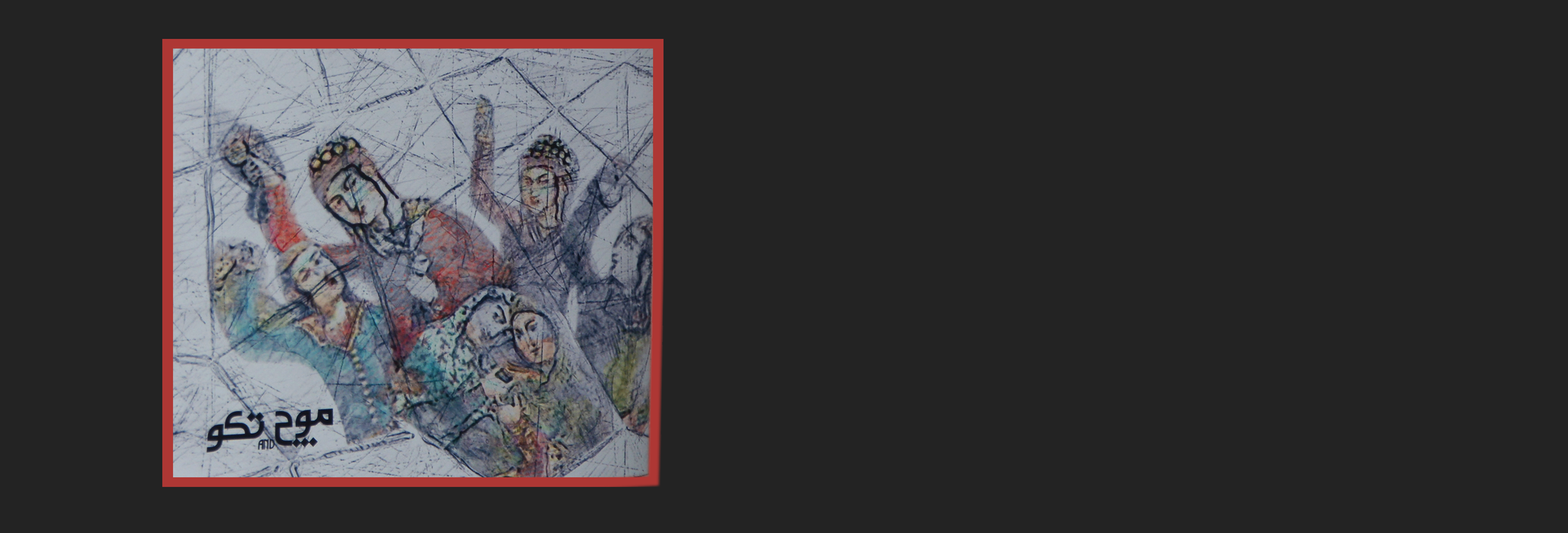
Close-up view of the women’s apparel packaging design. The illustration features female figures inspired by Persian paintings, while the line-art background motifs are derived from the traditional architectural technique known as Yazdi-Bandi.
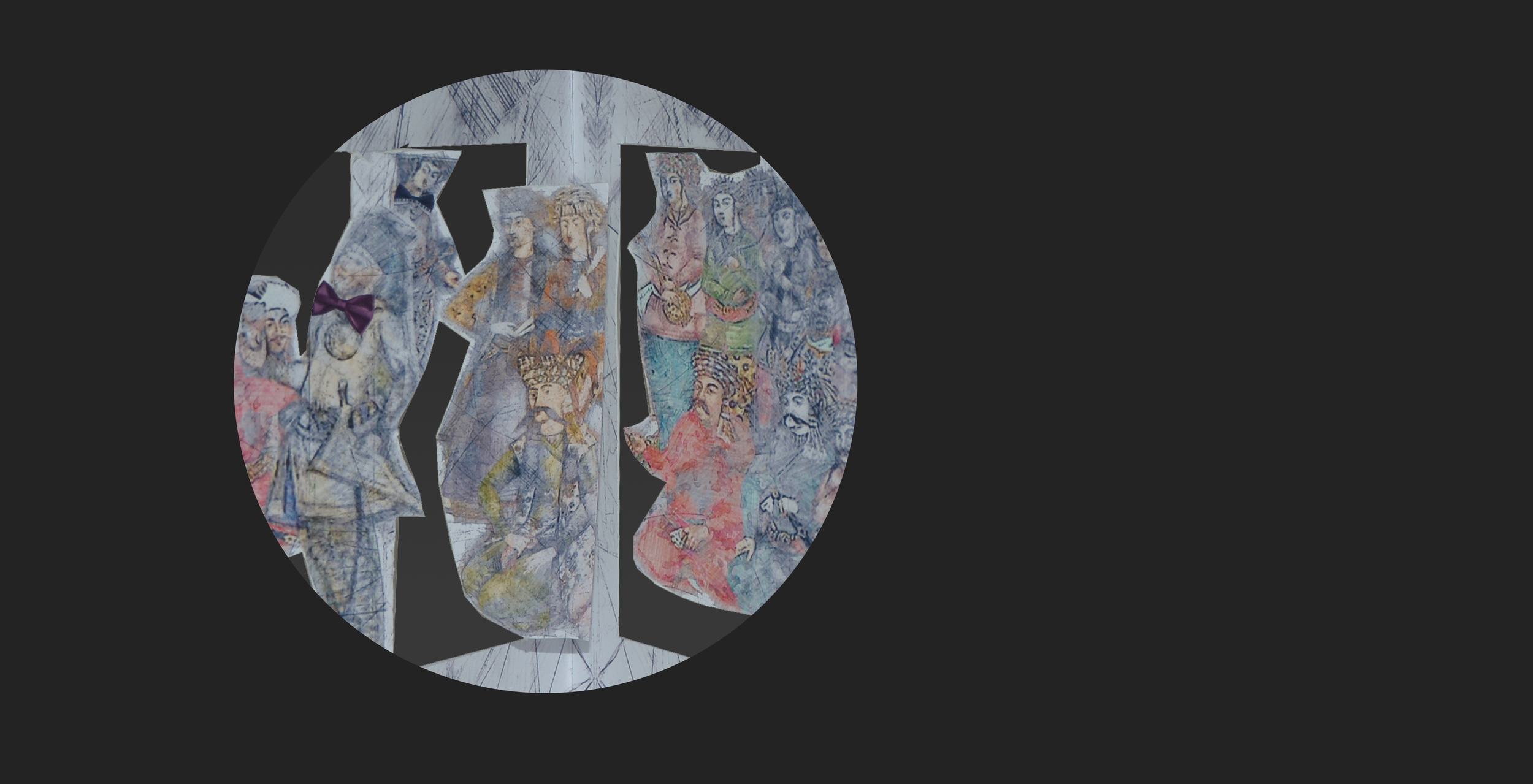
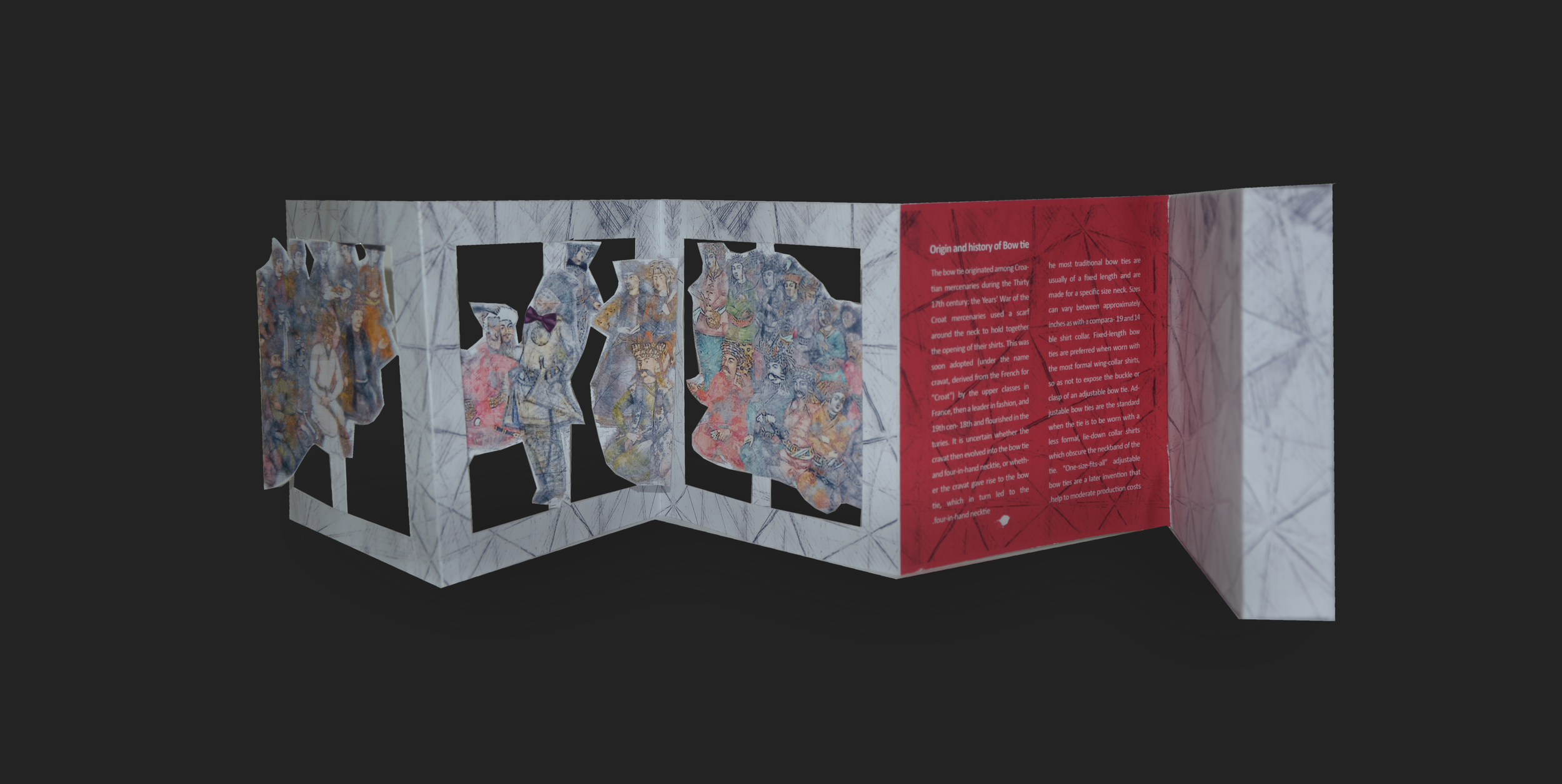
This is the packaging design for a men’s bow tie from the same brand collection. For the box, I used pop-up techniques and playful illustrations inspired by Persian miniature characters. In the pop-up scene, two central characters wearing traditional clothing walk down a runway while wearing bow ties, while other characters watch them from the sides, creating a lively and theatrical moment.
These are packaging designs for the Mooch and Takoo summer collection. For the structure of the boxes, I used origami techniques to create foldable and reusable packaging. For the visual design, I incorporated characters inspired by Persian miniature paintings and combined them with swim tubes to create playful summer scenes. A wave-like texture in the background adds the feeling that the characters are floating on water, reinforcing the light and joyful atmosphere of the collection.

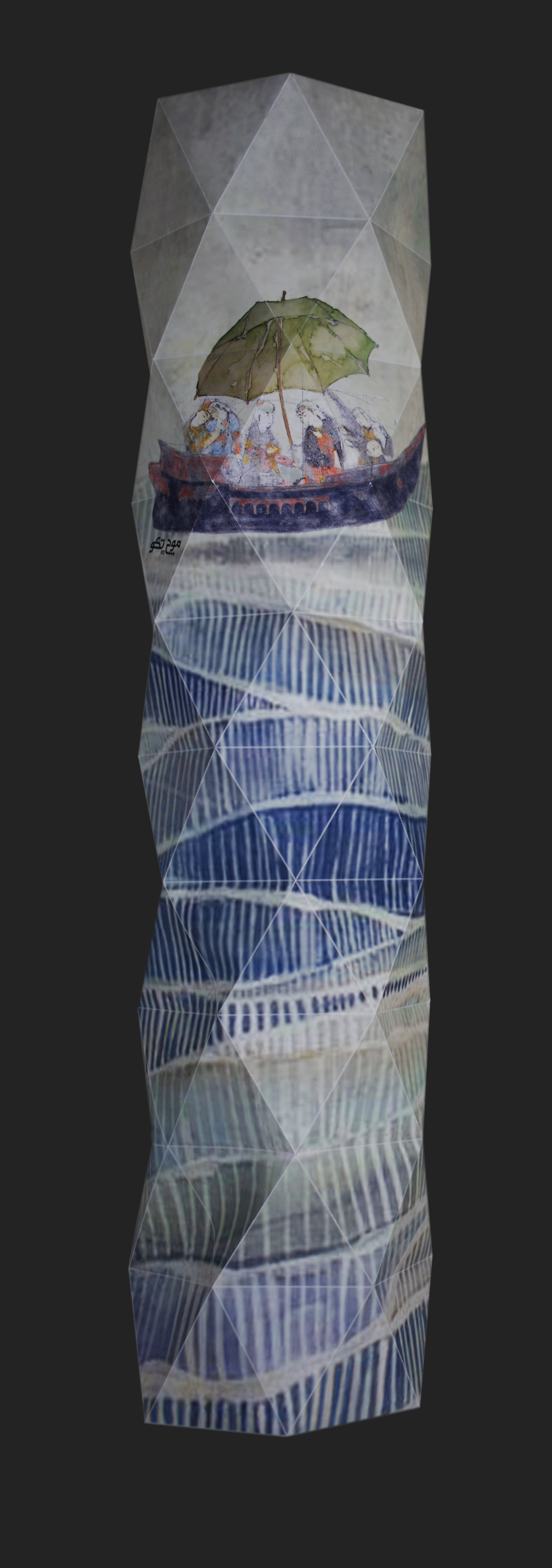

This is an origami-based packaging design for the same brand, created as a playful cover for an umbrella. The design features characters inspired by Persian miniature paintings holding an umbrella, adding a light and imaginative touch to the packaging.